Top: Home Page
Up: Table of Contents
Previous:
Next:
John S. Allen
| Pedestrian signs increasingly are being installed in Massachusetts based on a process
that evidently involves a community's receiving a grant, then arriving at its own design.
This phenomenon began, as I recall, with a research project through the Harvard School of
Public Health. The result is a proliferation of different kinds of signs, many consisting of nagging warnings about fines which are very rarely imposed, in tiny print which is illegible to drivers. Sometimes a whole forest of signs appears. Human factors analysis tells us that road signs need to be large and graphic, or use few words so they are understandable at a glance. How are the nag signs to be read, and by whom? By pedestrians, to make them feel better? Yes, the signs can be read by pedestrians walking along sidewalks. By drivers stopping 100 feet short of the crosswalk to take a reading break? Not very likely except in a traffic jam. I will grant that there has been a noticeable improvement in courtesy of drivers toward pedestrians in Massachusetts in recent years. Probably, drivers read these signs when they are pedestrians, or stuck in traffic jams. The yellow-red-white striped pattern of many of these signs has itself become a graphic icon, like a Chinese pictogram. It does not convey a direct graphic message like the stylized walking person on a conventional crosswalk sign. An unintended consequence: with better behavior toward pedestrians, motorists now often also yield right of way to bicyclists as if the bicyclists were pedestrians rather than vehicle operators. This phenomenon causes unnecessary delays, and can lead to confusion and crashes. A particularly perilous situation occurs when a motorist in the inside lane on a multilane street yields to a bicyclist arriving from the opposite direction and preparing to turn left. There are an illustration and description of this situation in my Bicycling Street Smarts. |
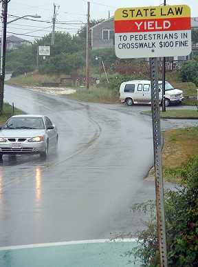
A tiny-print nag sign, instead of a
large, graphic sign, North Truro, 2003.

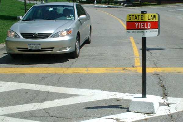
Brandeis University, in Waltham,
places a version of the same sign on a post
with a concrete base that can do some real damage to a car.
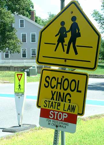
Complex of signs, one plastered over
another, in Sudbury, 2005.
The tiny-print sign is different from both in the examples above, (note STOP rather
than YIELD). The middle-of-the street post, here pulled aside as school is out,
is the modern, flexible kind and includes a miniaturized yield triangle and
ped-in-crosswalk sign. as well as a nag warning.
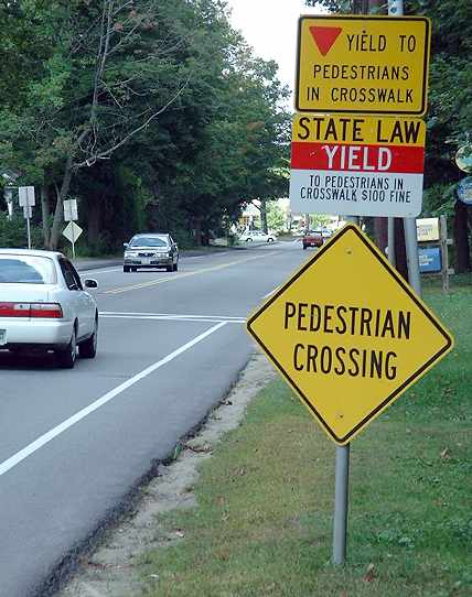
One, two, three signs, none graphic, in
a totem pole arrangement,
Route 27, Acton, 2003. If you take the time to read these,
you're not watching the road.
|
An older sign on a post at the
intersection of Main Street and
Hammond Street, Waltham. The standard diamond-shaped ped
warning sign is subsumed into a tiny image in the middle of the
verbose nag sign. This intersection rated as the worst for pedestrians
in Boston's western suburbs for several years in the late 1990s.
For more than a year during that time, one of the pedestrian
pushbuttons was broken. Is the intersection better now? If so, why?
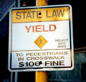
Another somewhat similar sign as used in Brookline.
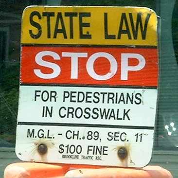
This sign is beat-up because Brookline installs it on top of
a plastic barrel in the
middle of the street and vehicles knock the barrel over. Here's one on
Longwood Avenue, 2002. The barrel reduces lane-sharing
width on this street which is heavily-used by bicycle commuters..
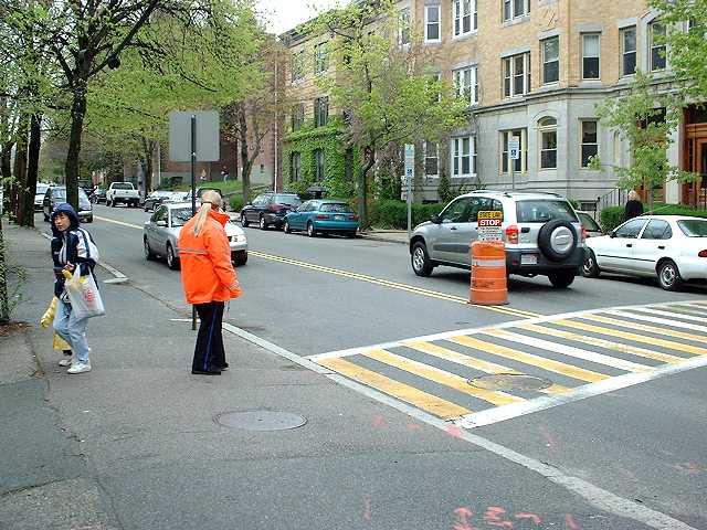
Overhead signals and sign, with
another type of illegible nag sign (at right)
on Broadway just south of Alewife Brook Parkway, Somerville. In-the-pavement
flashing lights were tried here but they broke down within a few months.
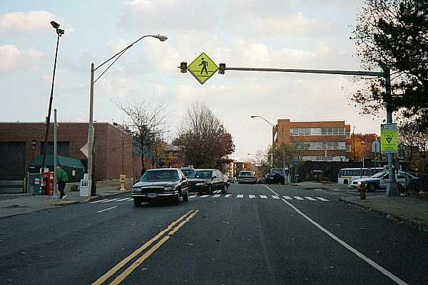
Flashing overhead sign with flashing
amber blinking lights
at side of roadway, on Broadway near Kendall Square, Cambridge
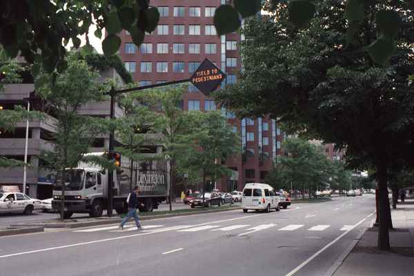
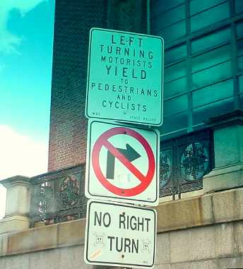
On Memorial Drive at Western Avenue, Cambridge
Motorists are always supposed to yield to
pedestrians and cyclists in the crosswalk.
What is the point of this small-print reminder then?
Probably a crash occurred here and "we had
to do something." And for those who don't understand
the graphic no-right-turn symbol, let's hope they read English.
Photo by Paul Schimek
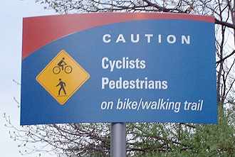
At an entrance to Boston Scientific,
along the
Assabet River Rail Trail in Marlborough. Graphic-
designer work with a cute swoosh and novel color scheme.
Nonstandard dual-image diamond-shaped warning sign
miniaturized and made subservient to the written word.
The lighter side -- a couple of
artistically-modified signs in Newton.
This one, a crosswalk sign in more than one sense,
is/was near the City Hall, June 2005
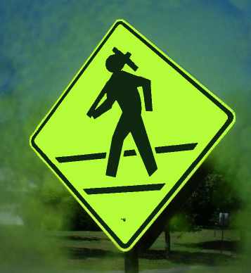
And another one, on Homer Street
approaching Newton Centre,
March 2006. See explanation below.
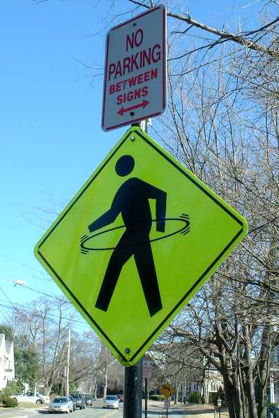
What's with the Hula Hoop?John, Just of reference purposes: The hula-hooping ped crossing sign is the mark of the devoted fans of the band "The String Cheese Incident." They are a "hippie rock" band somewhat in the vein of the Grateful Dead. This sign adaptation marked the crosswalk in front of San Francisco City Hall for months after they performed here a couple years ago. Nick E. Carr |