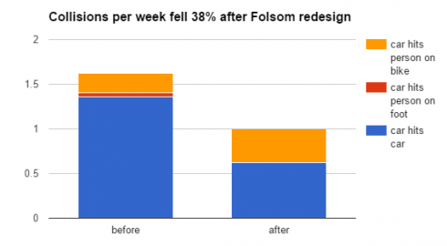
Here’s a quick review of an article by Michael Andersen of the PeopleforBikes Green Lane Project about the City of Boulder, Colorado’s removing what he calls a “protected bike lane”. I prefer to call it at barrier-separated on-street bikeway, avoiding a value judgment. Let’s see what the article in fact establishes.
According to the graph (copied above) and numbers in the article, the installation achieved a major reduction in collisions between motor vehicles at the expense of a 2.5 time increase in motor-vehicle-bicycle collisions. The article states that bicycle volume went up by 54%, and so the car-bicycle crash rate went up by about 1.6 times. Most car-bike crashes in urban areas involve crossing and turning movements. Forcing motorists to cross a bikeway to enter a travel lane, and forcing bicyclists and motorists to start turns from the wrong side of each other, make these crashes more difficult to avoid.
But the story gets more interesting if you click on the article’s link to city data. The left pie chart at the bottom of the city-data infographic shows crashes per year before the installation and the right pie chart, crashes per week following the installation. There were, on average, 11.3 car-bike crashes per year before the installation and 3 in 8 weeks, about 20 per year, afterward. That comes out to an increase of about 1.7 times, but the afterward sample is very small (3 crashes) and seasonal variation isn’t accounted for. The comparison has no validity.
Now look again at the graphs in the article. They don’t accurately reflect these numbers. The “before” bar reports about 0.15 car-bike crash per week or 8 per year, not the 11.3 per year in the pie chart, and so the graph shows an increase in bicycle crashes even greater than the numbers would suggest .
So, to sum up, the article reports a reduction in car-car crashes, but a large increase in car-bike crashes — while defending the bikeway as “protected” and failing to note that there isn’t enough “after” data to produce any statistically valid comparison.
Oh, and there’s also this, on the second page of the infographic:
“The bicycle volume increase along the corridor is consistent with the increase the city typically sees when school is back in session.”
The cyclist counts, unlike the crash counts, are robust. About half the increase is attributable to the school’s being back in session, not to installation of the separated bikeway — a point which Andersen neglects to mention.
To sum up:
What does the article say about the safety of the Boulder facility? Nothing. No conclusion can be drawn from the data, but despite that the Green Lane Project shot itself in the foot with a graph showing a large increase in bicycle crashes.
What does the say about bicycle use? Maybe an increase of 20% or so due to installation of the bikeway, though some of that may only have been transferred from another street.
What does the article say about the quality of Green Lane Project journalism? I think that I’ve made my point but you can answer that for yourself.

