In cities around the USA, politicians, under pressure from populist bicycling advocates, have pointed to the NACTO (National Association of City Transportation Officials) Urban Street Design Guide and directed their engineering staff to install treatments which it describes.
I’ll say right here that some of the treatments which the NACTO guide describes deserve attention and inclusion in national design standards — though their presentation in the NACTO Guide typically is flawed, inconsistent and incomplete. Why some deserving treatments are not included in the national design standards is a story for another time.
Other NACTO treatments are so troublesome that they are not widely applicable.
Engineers unfamiliar with bicycling issues may take NACTO designs at face value; other engineers may throw up their hands and comply, faced with the threat of losing their employment. Several engineers who have extensive background and expertise in design for bicycling have resigned, been fired or been demoted when they would not accept the NACTO designs.
What leads to these problems? To put it simply, the NACTO guide isn’t a design manual. It is a smorgasbord of design treatments formatted — right down to digitally-generated loose-leaf binder holes on what are, after all, Web pages — to look like a design manual to politicians and the general public. Bicycle manufacturers funded it to promote street designs which they expect will lead to greater bicycle sales. It lacks the vetting necessary for consistency and accuracy. Its purpose is to generate political pressure to apply the treatments it describes. It is weak on specifics: rife with errors, and with omissions even in describing the treatments it covers.
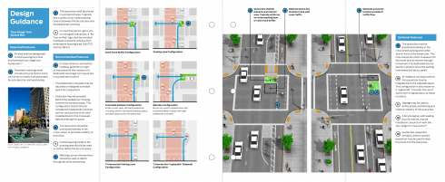
If I described all of my specific concerns with the NACTO Guide, I’d be writing a book, so for now let’s just look at a two-page spread of the NACTO Guide, the pages about two-stage turn queuing boxes (2STQBs, for short).
Maybe by now you are inclined to think of me as a naysayer, so, let me get down to some specifics to dispel that impression. I have had information about two-stage turn queuing boxes online for years, I think that they are a useful treatment, and I use two-stage turns: when I realize that I have reached the street where I need to turn left, but hadn’t merged to turn; when traffic is heavy and fast and I haven’t found an opportunity to merge; when ordinary left turns are prohibited. My favorite example is the left turn from Commonwealth Avenue onto the Boston University Bridge in Boston, Massachusetts, where a no-left-turn sign is posted: motorists have to go around a large loop.
Ok, now let’s consider the spread from the NACTO guide, below.

NACTO pages about two-stage turn queuing box
I have placed that spread online as a PDF file, zoomable to any size you might like. You may click on the link or the image above to get a larger view while reading this text. The PDF will open in a separate browser window or tab. I’ve also posted parts of the NACTO pages in connection with the text below.
Issues of organization and use of technical language
The NACTO treatment of the two-stage turn queuing box presents issues of organization and of use of technical language.
Problems start with the title of the section. A proper title is not “Design Guidance”, otherwise, every section would be named “Design Guidance”. A proper title is the name of the device, here “Two-Stage Turn Queuing Box”. [And not “Queue” but” Queuing.”]
In a proper design manual, the terms “shall”, “should”, “guidance” and “option” go from strong to weak. “Shall” is imperative: for example, a stop sign shall be octagonal. Should, guidance and option statements are increasingly weaker, leaving more room for engineering judgment.
The terms “Required Features” and “Recommended Features” correspond roughly to “shall and “should” but do not have the explicit, legally-defined meanings of “shall” and “should”.
None of the drawings on the two pages are dimensioned, and no dimensions are given in the text. That is to say, these are not engineering drawings, they are only conceptual drawings. How big are the turn boxes supposed to be? Who knows? The width of travel lanes differs from one drawing to the next, but no explanation is given for that. When politicians start beating on the door for NACTO treatments, standards-setting bodies and traffic engineers have to try to fill in the missing information. For specific projects, that task often is passed along to hired consultants who make their living by promoting and designing special bicycle facilities. Yes, there is a conflict of interest.
Specific comments
Now, either click on the image of each section of the page below to open it in a separate browser tab, or zoom the PDF to at least 50% size so you can read the text in connection with my specific comments .(You may open it now if you didn’t already.)
Comments on the left-hand page
The left-hand page includes text which may look like design specifications, and drawings which may look like design drawings — to a layperson.
Left half of left-hand page
Point 1: “An area shall be designated to hold queuing bicyclists and formalize two-stage turn maneuvers.” This is under the heading “Required Features.” A 2STQB is only one way to turn left among others, an option, subject to engineering judgment or specific design warrants. There is neither the room nor the need for a 2STQB at most intersections. Lacking here is any statement as to where a 2STQB is appropriate, but the “shall” statement here is inappropriate: appropriate shall statements would describe what features are required if a 2STQB is installed. As of May 2014, the 2STQB is still in experimental status with the Federal Highway Administration — as are all details of its design, and so no “shall” statement at all is appropriate.
A proper design manual would include guidance about speed and volume of traffic; the additional delay usually required for a two-stage turn; whether bicyclists might take an alternate route entirely; whether use of the box is mandatory, placing bicyclists who make other types of turns in violation of the law.
Point 4: “In cities that permit right turns on red, a no-turn-on-red sign shall be installed.”
According to the wording here, if the installation is not in a city, the sign is not required.
But also, the shall statement is overly broad, and incomplete. The sign is needed only if right-turning traffic would be in conflict with the bicyclists waiting in the 2STQB: unnecessary in the cross street if traffic turns right before reaching the box or cannot turn right, and unnecessary on the entry street if the cross street is one-way right-to-left. Does the sign belong on the entry street or the cross street, or both? That is not stated. Details, details…
Point 6: The comma makes nonsense of this sentence. Where is the box to be positioned?
The other, subsidiary “should” and “may” statements on this page also are contingent on official approval of the underlying design, and are lacking in detail.
Right half of left-hand page
Something really leaps out at me here: take a look and see whether it leaps out at you too.
OK, ready? Three of the six illustrations show a line of travel (in blue) for bicyclists straight across an intersection and then illegally and hazardously turning right, directly into the face of approaching traffic in a cross street.
In showing this bizarre routing, the NACTO Guide also fails to address issues with the actual route which bicyclists might take.
Five of the six illustrations show that bicyclists would somehow turn 180 degrees in place. That requires dismounting and is slow and awkward. How would a bicyclist turn when the traffic light is about to change? When other bicyclists are already in the box? What about tandems? Bicycles pulling trailers? Bicycles carrying heavy baggage?
The drawings show a subtly implied but selectively addressed-threat: lanes where motorists travel are shown in a threatening shade of pink — whoops: except in the cross street where bicyclists ride head-on at motorists.
Four of the six illustrations show motor vehicles in right-hook conflict with bicyclists headed for the queuing box. The motor vehicles are turning out of the threatening pink area into what is portrayed as the safe zone– the right-hook zone. In two of the pictures, vehicles have already impinged on the blue line which represents the path of bicyclists crossing the intersection. Green paint, which has become a catch-all warning of traffic conflicts in bicycle facilities, is shown in the queuing box, it is not shown in the conflict zone. (By way of comparison, Dutch practice in such conflict situations is that the motorist must always yield, and to use “shark teeth” markings to indicate a yield line.)
Two of the drawings show bike lanes in the door zone of parked cars.
The middle left illustration shows a receiving bike lane at the top, out of line with dashed markings in the intersection, so bicyclists bear right just before they cross a crosswalk, potentially colliding with pedestrians who would expect them to continue straight.
All of the illustrations show two-stage turns across two-lane one-way streets, though the two-stage turn queuing box is most useful where a conventional left turn is illegal, unusually difficult or hazardous — for example, when turning from a major, wide arterial street with heavy traffic, or one with trolley tracks in the median.
As already indicated, none of the drawings are dimensioned and no dimensions are given in the text.
Comments on the right-hand page
The right-hand page gives annotated pictures of conceptual installations, with angled views from overhead.
Left half of right-hand page
The street going from bottom to top in the picture is one-way, as can be inferred by the direction in which vehicles are traveling. That the cross street is two-way may be inferred from the locations of traffic signals and the existence of the queuing box. A real design manual would be explicit about how a treatment would apply, depending on the directions of traffic in the streets.
The end of the traffic island next to the queuing box protrudes so far and sharply as to make right turns awkward. No explanation or guidance is given on this issue.
Traffic signals are shown for motor traffic on both streets, but no traffic signal is shown facing the separate bikeway in the street!
Point 3: “Shall” — mandatory — wording differs from that in the same point as made on the opposite page. A real design manual would have a single, consistent statement.
“Queue box shall be placed in a protected area.” The queuing box shown here is not protected from right-turning traffic in the cross street. How would that right-turning traffic be managed, or is it permitted at all? Such issues are addressed in a real design manual.
Point 6: “Optional queue box location in line with cross traffic.” The preferred queuing box, then, is not in line with cross traffic. On getting a green light, bicyclists in the queuing box would have to merge left inside the intersection unless there is a receiving bike lane after the intersection, but none is shown. Merging inside an intersection results in hazardous conflicts and is generally illegal. What warrants the choice of one or the other option? It isn’t stated.
Point 8: The illustration shows motorists and a bicyclist inside the intersection, and so they must have a concurrent green light — or, they would if any signal were shown facing the bikeway. Markings guide bicyclists across the intersection, but also into the path of right-turning traffic. The bicyclist and the motorist in the right-hand lane at the bottom of the picture are on a collision course if the motorist turns right.
What is the meaning of the curved markings adjacent to the bicycle parking in the middle of the street? Does the lane with bicycle parking start as a lane with car parking, additionally hiding bicyclists from turning motorists? Or is this an additional lane for motor traffic, discontinued at the intersection, precisely where more lanes are needed to store waiting traffic? Not shown.
Right half of right-hand page
There is a right-hook threat at both bike lane entries to the intersection.
Bicyclists headed from bottom to top in the bike lane are riding in the door zone of parked cars, and closer to the cars after crossing the intersection.
Point 9: As in the left half of the page, placing the queuing box to the right of the travel lane when there is no receiving lane ahead assures that motorists will overtake bicyclists in the intersection and that bicyclists will have to wait for motor traffic to clear before they can proceed. Motorists waiting to turn right will be stuck behind the bicyclists. Placement out of line with motor traffic is described as the option here, rather than as the preferred treatment as on the left side of the page, and the problem is acknowledged in the caption to this drawing, though no explanation for the different choices is given.
Point 10: A jughandle may be useful if traffic is so heavy or fast that bicyclists have difficulty merging to the normal left-turn position near the center of the street, but then traffic is also so heavy and fast that a signal is usually necessary, not merely to be considered — unless there is already one upstream.
Point 11: Yes, signage may be used, but what signage? A real design manual would show the signs and where they are to be placed.
Point 12: A bicycle signal might be installed, but where? For the entry? For the exit? Its timing?
Point 13: Guide lines, pavement symbols and/or colored pavement. Which? Where? Why?
Had enough?


